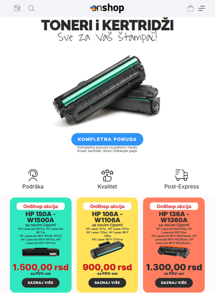
OnShop is a modern online store specializing in printer toners and cartridges, successfully operating for over a year. The project began as a simple e-commerce platform designed to make purchasing printing supplies online easier, but over time it has developed into a comprehensive sales system with features that address the real needs of users and the market. Today, the store offers more than 1,400 products carefully organized by categories and printer models, allowing customers to quickly find the right product. The goal was to make the entire process — from product search to completing the order — as simple, clear, and visually appealing as possible.
Design and user experience
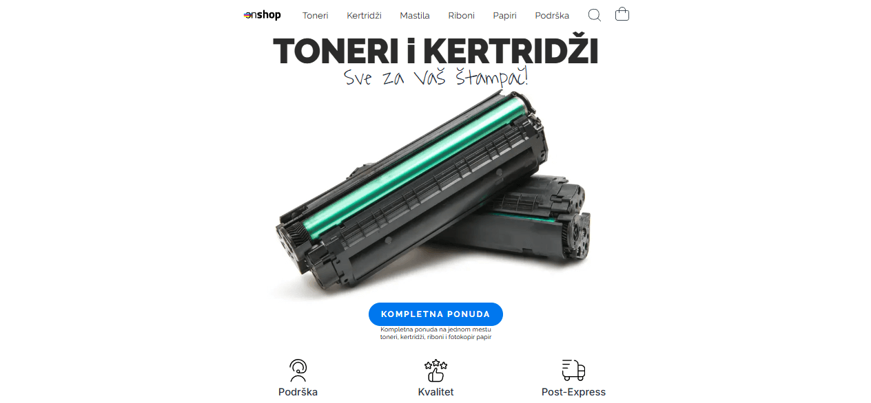
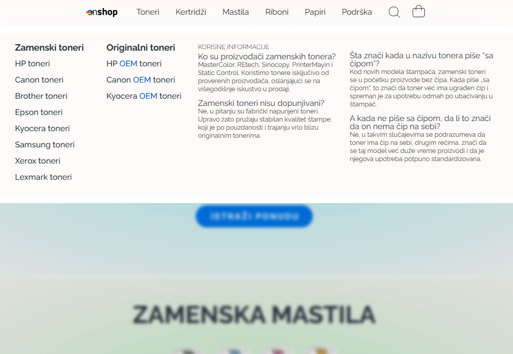
The website is crafted in a minimalist style, with soft shades of pink dominating the background, creating a sense of lightness and order. Special attention has been given to readability, color harmony, and element layout. All components are carefully placed to provide users with an intuitive experience without unnecessary content.
On the desktop version, a modern mega menu has been implemented, allowing easy navigation through the numerous product categories. The menu also includes sections such as Frequently Asked Questions, making them immediately accessible to customers without additional searching. When the menu is opened, a blur effect is applied to the background, focusing the user’s attention solely on the category selection. Frequently Asked Questions, which are immediately accessible to customers without the need for additional searching. When the menu opens, a background blur effect is activated, directing the user’s attention solely to the category selection.
Adapted for all devices
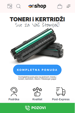
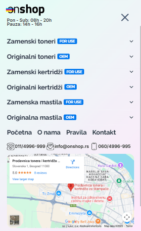
The website is fully responsive and adapted to all screen types. On mobile devices, navigation is further simplified. A two-layer popup menu has been implemented, which, in addition to standard categories, includes an integrated Google map showing the store’s exact location. This allows users to immediately see where the store is and easily decide between in-person pickup and delivery. Another practical feature of the mobile version is the fixed “Call” button at the bottom of the screen, visible on all pages except during the checkout process. With a single tap, customers can call the store, further enhancing accessibility and trust.
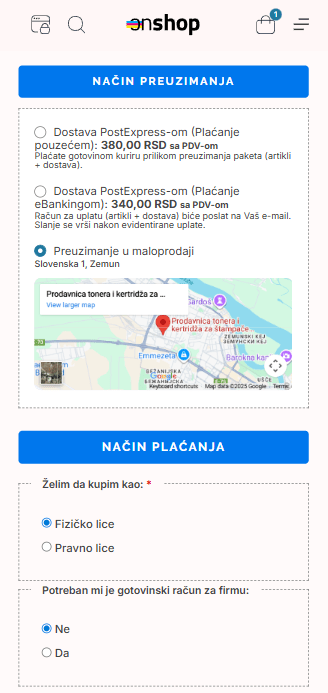
Checkout system and custom fields
The checkout process is designed to offer customers three simple options:
- Cash on delivery,
- Payment via eBanking,
- In-store pickup.
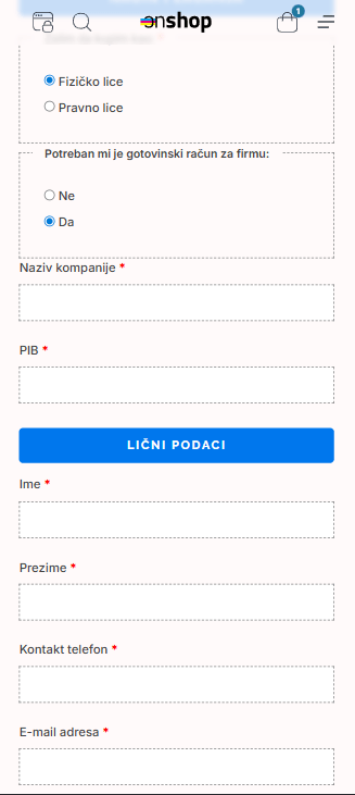
When a customer selects in-store pickup, the system automatically hides unnecessary fields such as address, city, and postal code, making the ordering process faster and simpler. An interactive Google map is displayed below, further easing location finding. In addition to standard information, custom checkout fields have been developed, allowing customers to specify whether they are purchasing as an individual or a business. Based on this choice, hidden fields such as tax ID, company name, or account type appear, preventing confusion and reducing the chance of errors.
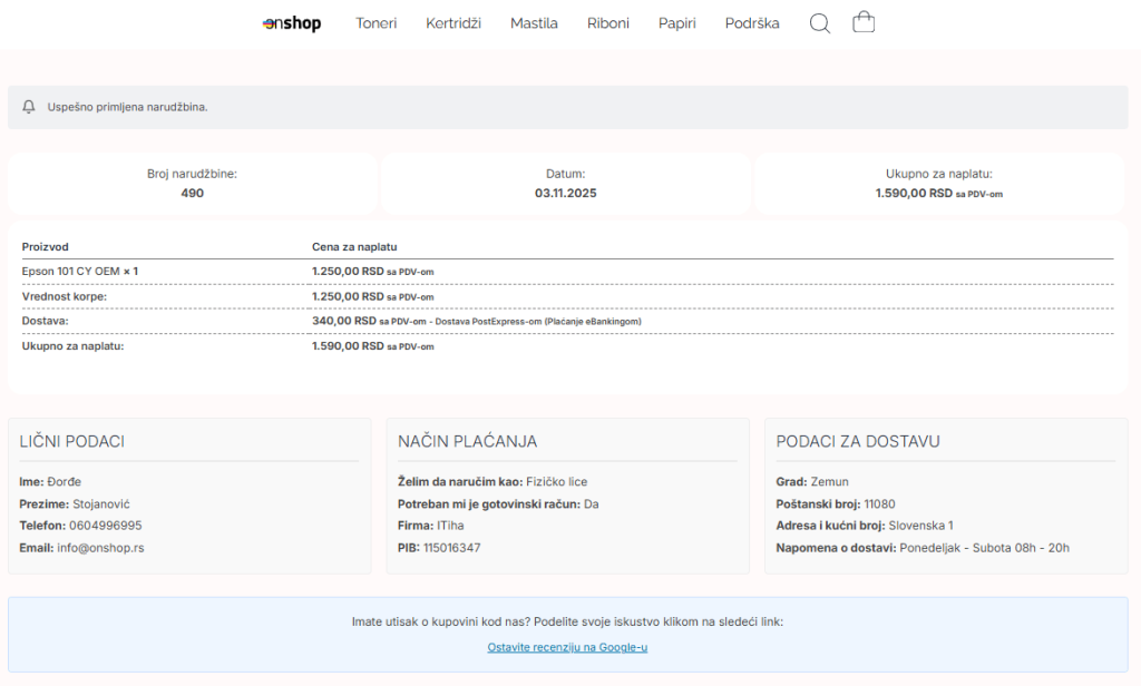
Thank You Page and email confirmation
After completing a purchase, the user is greeted by a specially designed Thank You page, structured to include all essential information without the need for scrolling — order number, date and time, a summary of items, and basic customer details. At the same time, the customer automatically receives an email confirmation of the successful order, featuring a minimalist design fully aligned with the website’s visual identity.
Conclusion
OnShop is an example of a carefully planned and consistently executed e-commerce project, combining clean design, intuitive navigation, smart user flow adjustments, and a technically stable backend. The result is an online store that stands out visually while functioning quickly, simply, and efficiently — exactly as modern users expect.